Why customers abandon online orders and how to improve conversion

A customer may visit your restaurant website intending to place an order and still give up before payment. The reason is not always the price. Sometimes an unclear delivery fee, missing information about fulfilment time, a difficult-to-browse menu or a form requiring too many steps is enough to make them leave.
With online ordering, every additional uncertainty works against you. The customer is not standing at the till and cannot immediately ask a member of staff. If something is unclear, they may close the website and choose another option. That is why it is worth going through the entire ordering process as if you were someone who had never used your website before.
Start with the menu, because this is where the first decision is made
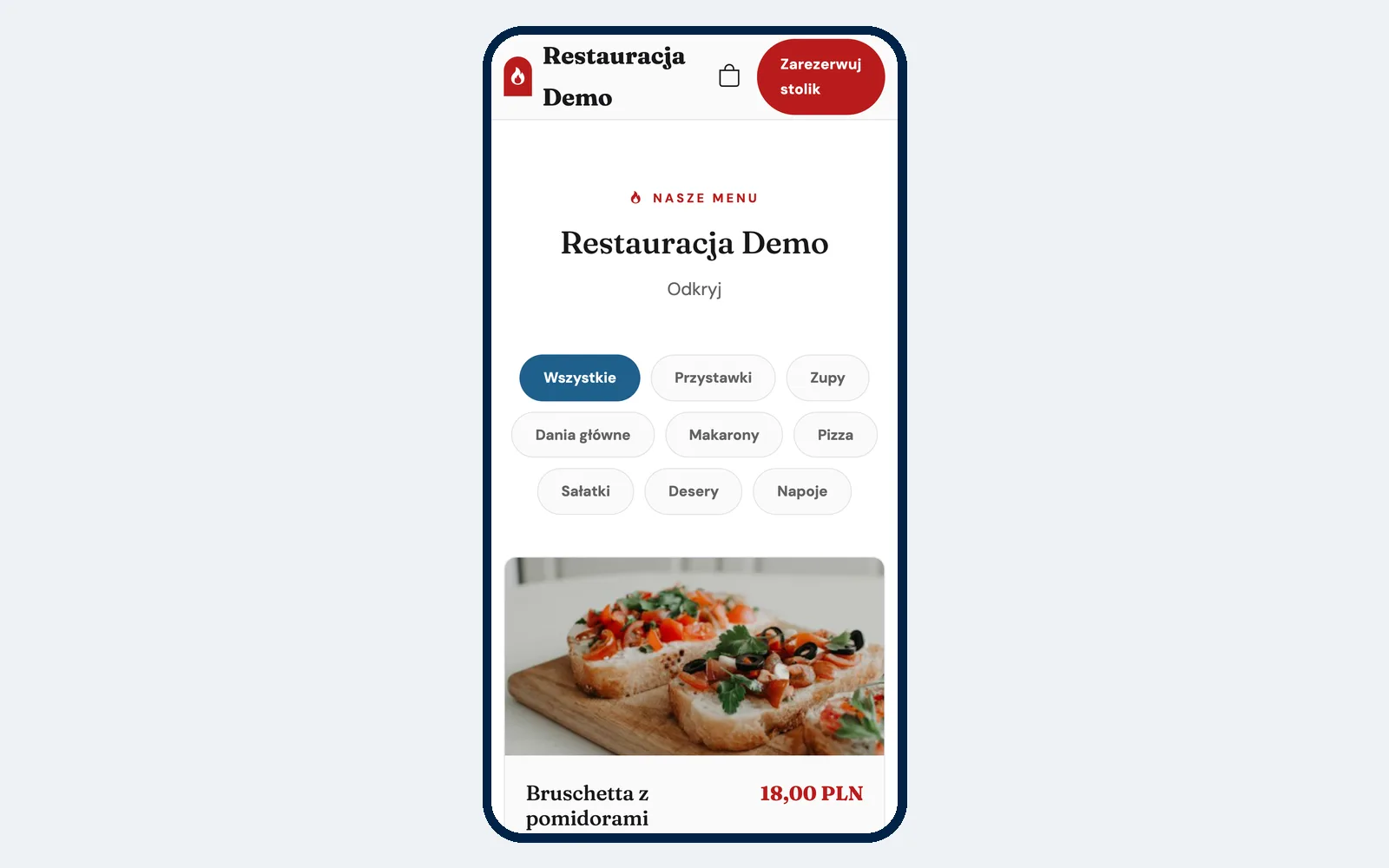
An online menu should not simply be a digital copy of your printed menu placed on a website. A customer using a phone needs quick access to categories, dish names, prices and basic information.
Dish names should make it clear what the customer is ordering
A creative name may look good on a menu, but for online ordering the description should remove any uncertainty.
Instead of simply calling a dish “Chef's Special”, it is better to add a short description of the key ingredients. Customers should understand what to expect before opening the product details.
Photos help, but only if they are clear
A photo can make choosing easier, particularly with pizzas, burgers, desserts or dishes whose names do not explain much. It does not have to come from a professional advertising shoot, but it should show the actual dish clearly and be consistent with what you serve.
However, it is not worth adding random images simply so that every dish has a picture. If the photo does not match the actual product, it can do more harm than good.
Allergen information should be easy to find
A customer with an allergy or intolerance should not have to search in several places or call the restaurant just to find out about basic ingredients. Allergen information should be available next to the dish or in its details.
This does not replace the restaurant's own food safety procedures, but it makes it easier for customers to make a decision before adding an item to their basket.
Show the delivery cost and minimum order before the customer builds their basket
One of the most frustrating situations is when a customer spends several minutes choosing dishes and only then discovers that their address requires a higher minimum order value or that delivery costs more than expected.
If delivery conditions depend on location, it is worth showing them as early as possible.
The customer should know:
- whether the restaurant delivers to their address,
- how much delivery costs,
- what the minimum order value is,
- the estimated fulfilment time,
- whether collection is available.
Example: at 19:00 on Friday, a customer adds PLN 48 worth of dishes to their basket. Only at the final step do they discover that the minimum order for their delivery zone is PLN 70. Even if the rule is justified, the information appeared too late.
If you deliver to several areas under different conditions, the article about delivery zones and minimum order values may be useful.
The fewer unnecessary steps, the better
The ordering process should be simple, but that does not mean it always has to contain a specific number of screens. What matters more is whether each step is actually necessary.
Problems appear when the website requires:
- creating an account before placing the first order,
- entering the same information more than once,
- moving through separate screens without a clear reason,
- completing fields that are not needed to fulfil the order.
Do not force customers to create an account
If someone simply wants to order lunch once, mandatory registration can become an obstacle. An account may be useful for regular customers, but a first order should be possible without unnecessary formalities.
The faster customers can move from choosing a dish to confirming the order, the fewer places there are for them to stop because of a confusing form.
Payment needs to be convenient on a phone
If most customers open your website on a smartphone, the payment process should be designed for it. For many people, fast methods such as BLIK or card payments through a payment provider are important.
It is not just about the number of payment methods. Customers should clearly see when they are paying, who they are paying and what will happen after they confirm the transaction.
If you offer online payments, test the whole process yourself on a phone. Check whether:
- the payment provider's website opens correctly,
- the return to the restaurant website after payment is clear,
- the customer receives confirmation,
- no unclear messages appear along the way.
Current fees and terms offered by payment providers should be checked directly with the selected provider. If you want to compare how the integrations themselves work, see the article about online payment integrations for restaurants.
Tell customers straight away how long fulfilment will take
After placing an order, the main thing a customer wants to know is when they can expect their food.
A lack of information about fulfilment time leads to more calls to the restaurant:
- “Did you receive my order?”
- “When will it be ready?”
- “Has the driver left yet?”
If the system shows an estimated fulfilment time, this information should be visible before the order is confirmed or immediately afterwards. It is also worth distinguishing between delivery, collection and dine-in orders if those channels operate differently.
Do not use one fulfilment time for every situation
At 14:00 on Monday, the kitchen may be able to fulfil orders much faster than at 19:30 on Friday. If your system allows you to control order acceptance rules and fulfilment times, it is worth adjusting them to the restaurant's actual workload.
Order confirmation should remove uncertainty
After clicking “Place order”, the customer should not be left wondering whether the form worked.
A good confirmation should clearly show:
- that the order has been accepted or is awaiting confirmation,
- the order number,
- the selected fulfilment method,
- the delivery address or collection location,
- the current status, if the system provides it.
Even better, customers should be able to check the status themselves later instead of calling the restaurant.
The website should be designed primarily for phones
It is not enough to open the website on a computer and decide that everything works. It is worth going through the ordering process on several different phone screen sizes.
Check in particular:
- whether dish names are cut off,
- whether images push the price off the screen,
- whether buttons are easy to tap with a finger,
- whether the basket is easy to find,
- whether the address form works without zooming in,
- whether variants and extras are easy to understand,
- whether payment can be completed without switching to a computer.
Scheduled orders can save sales outside opening hours
Customers do not always want to order at the exact moment they visit the website. They may be planning dinner for the evening, collection after work or an order for a specific time the next day.
If the website simply shows a “closed” message outside opening hours, the customer has no way to take the next step.
Scheduled orders allow the restaurant to accept orders in advance, provided the fulfilment rules are configured accordingly. It is worth clearly showing the available times so customers know when their order can be prepared.
A promotion should make the decision easier, not make the basket more complicated
A good promotion can encourage customers to complete an order, but only if the rules are simple.
Examples:
- free delivery above a certain order value,
- a free product with a specific meal deal,
- a discount on a selected category,
- a discount code for a specific group of customers.
Be careful when combining several promotions at the same time. If customers do not understand why a code is not working or which products they need to add, the promotion starts creating more questions instead of making the decision easier.
What about abandoned baskets?
An abandoned basket means that someone started an order but did not complete it. The reason may be simple: a phone call, an interrupted payment, lack of time or a change of mind.
Not every abandoned basket can be recovered, and you should not assume that abandonment always means there is a problem with the website. However, if the system supports e-mail reminders, they can bring some customers back to the ordering process they started.
Such a reminder should be short and relate to the specific unfinished order rather than turning into a general advertising campaign.
The 10-minute test — check your ordering website yourself
You do not need an extensive audit to find the first problems. Take your phone, start a timer and spend 10 minutes behaving like a new customer who is ordering for the first time.
- Open the website on your phone. Is it immediately clear where to start an order?
- Find a specific dish. Are the categories clear without requiring excessive scrolling?
- Check the description. Do you understand the ingredients, variants, extras and allergens?
- Add several products. Can you immediately see the current basket value?
- Enter an address. Can you see the delivery cost and minimum order value before checkout?
- Change the fulfilment method. Test delivery and collection if both are available.
- Try to schedule the order for later. Is choosing the time straightforward?
- Proceed to payment. Can you use a convenient payment method on your phone?
- Check the confirmation. Do you know that the order has been received and when it will be fulfilled?
- Find the order status. Can you check what happens next without calling the restaurant?
It is best to repeat this test on the phone of someone who does not know your website. Do not tell them where to click. Note the places where they stop for longer, return to the previous screen or ask a question.
How does Ranedo handle online ordering?
In Ranedo, the restaurant website and online ordering are available in all plans. The website can be built using ready-made templates and edited without a developer. The menu can include categories, dishes, variants, extras, allergens, photos and labels.
For deliveries, you can define zones based on a radius from the restaurant, an area drawn on a map or postcodes. Each zone can have its own delivery price, minimum order value and delivery time, while the customer's address is checked automatically.
Scheduled orders are also available in all plans. Online payments can be processed through Tpay, Przelewy24 or PayU. You arrange the contract and fees directly with the payment provider, and Ranedo does not charge commission on orders.
After placing an order, the customer receives confirmation by e-mail or, if they did not provide an e-mail address, by SMS, with a link to track the order status.
Promotions and abandoned basket recovery
In the Plus and Pro plans, you can create percentage or fixed-value discounts, free delivery, a free product, a “buy X, get Y” promotion, discount codes and meal deals at promotional prices.
In the Pro plan, automatic abandoned basket reminder e-mails are available.
You can find more information about online sales features in the Ranedo features section.
Remove obstacles first, then increase traffic
If your website gets traffic but few people complete their orders, spending more on advertising is not always the first step. Start by checking whether the process is clear.
Customers should be able to answer a few questions quickly: what can I order, how much will I pay, how much does delivery cost, when will I receive my food and how can I pay? If this information is available without searching, the path from entering the website to confirming an order becomes simpler.
Only once the process works well on a phone is it worth directing more traffic to it from advertising, social media, your online business listing or materials in the restaurant.
Try your own online ordering in practice
With Ranedo, you can launch a restaurant website, menu and online ordering from the Start plan, while higher plans add promotions and other features. Check the available plans or create an account and use the free first month with all features included in your selected plan.
Frequently asked questions
Why do customers add products to their basket but not complete the order?
There can be many reasons: an unexpected delivery charge, a high minimum order value, a difficult form, no convenient payment method, unclear fulfilment times or simply an interruption during the process. The best approach is to go through the whole process on a phone and check every point where an additional decision is required.
Do customers need to create an account before ordering?
It is better not to require registration if it is not necessary to fulfil the order. For a new customer, an extra password and form can be an unnecessary obstacle.
Is it worth showing the delivery cost before the basket?
Yes, if possible. The earlier customers know the delivery conditions and minimum order value, the lower the risk that they will only discover them at the final stage.
Do scheduled orders make sense?
Yes, particularly if customers plan collection or delivery in advance or visit the website outside the hours when immediate orders are being fulfilled. The important thing is to show the available times clearly.
Does Ranedo send abandoned basket reminders?
Yes. Automatic abandoned basket reminder e-mails are available in the Pro plan.
Share this article: